Neulbom Speech Therapy
Children's therapy center Branding
Children's therapy center Branding
Studio tanGiBle has developed the brand identity for Neulbom, a therapy center for children with language development disorders. To emphasize the unique aspect of being a brand focused on language therapy, the identity visually represents linguistic elements.
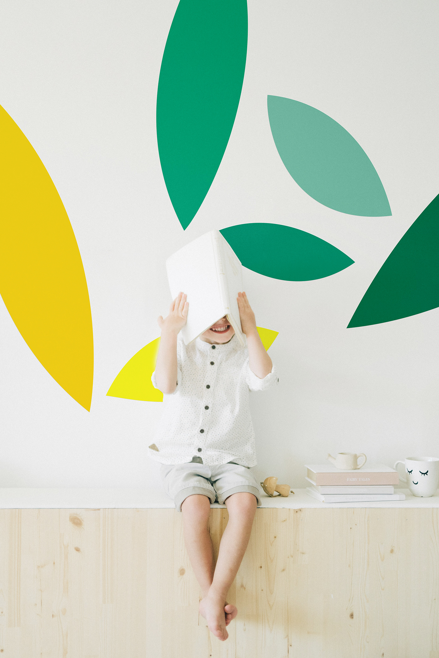
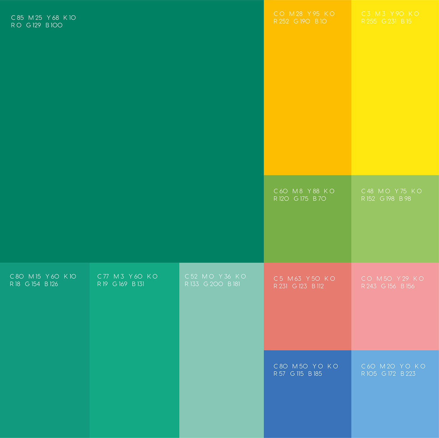
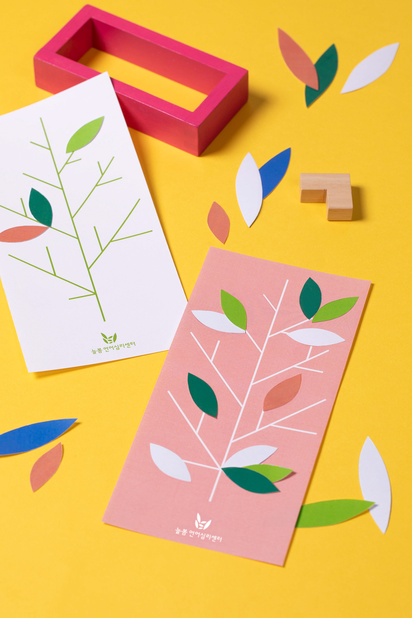
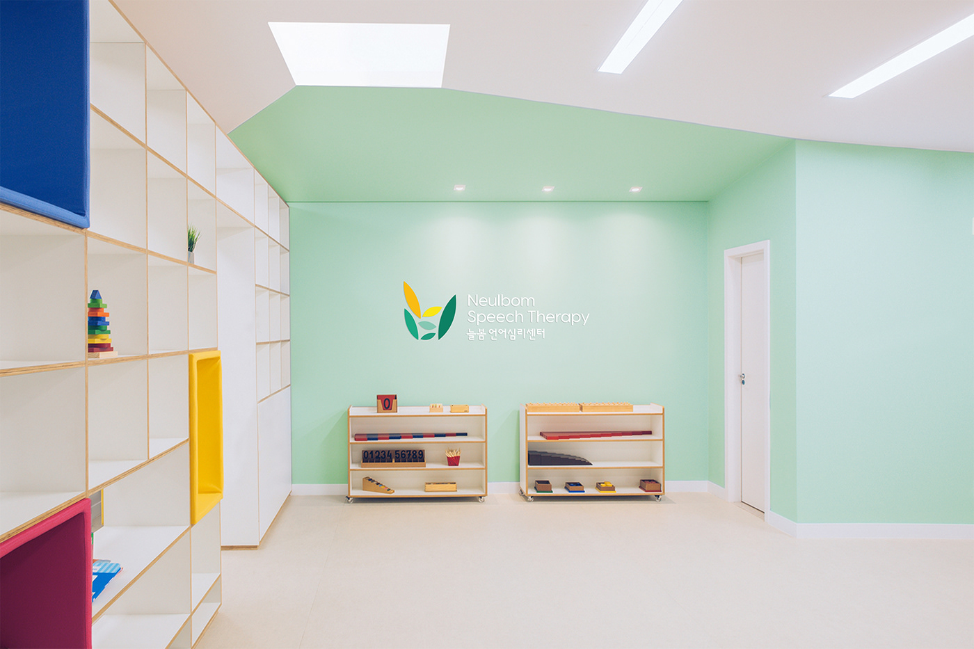
The initial consonants of the brand name, ㄴ (N) and ㅂ (B), are depicted as vibrant leaves blossoming in spring. The accumulating leaves symbolize the hope and fruition that children will achieve through the brand, akin to the announcement of spring. The brand palette is filled with colors associated with spring, with a friendly tone that appeals to children. Starting from the main color green, it transitions to soft colors such as yellow, pink, and blue. This soft color scheme plays a role in connecting with children on an emotional level, going beyond therapy to provide a sentimental brand experience.
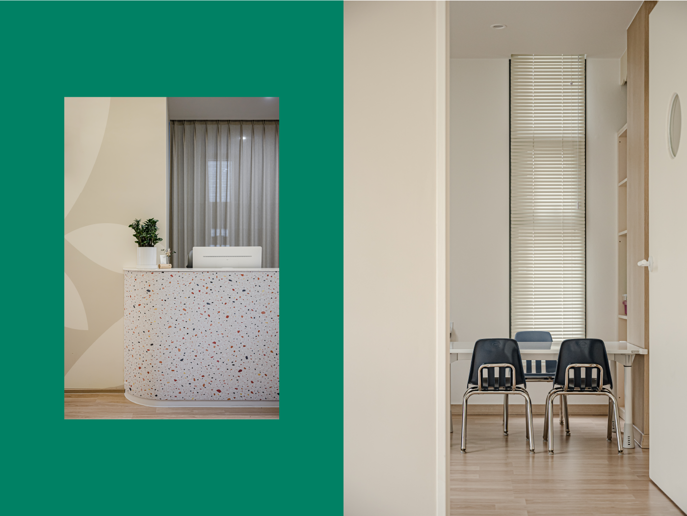
The consistent application of various leaf shapes and colors throughout Neulbom's space reflects the brand's vision for children's dreams and aspirations. May the brand blossom like leaves, fostering the dreams and hopes of the children Neulbom aims to serve.
_
스튜디오 텐저블은 언어발달장애를 겪는 어린이들을 위한 치료센터인 늘봄의 브랜드 아이덴티티를 개발했습니다.
언어를 치료하는 브랜드로서의 특장점을 강조하기 위해 아이덴티티에 있어 언어적인 부분을 시각적으로 표현하고자 했습니다.
언어를 치료하는 브랜드로서의 특장점을 강조하기 위해 아이덴티티에 있어 언어적인 부분을 시각적으로 표현하고자 했습니다.
브랜드 네임의 초성인 ㄴ,ㅂ을 봄에 피는 생동하는 잎을 모티프로 하여 나타냈습니다. 쌓여가는 잎들이 모여 봄을 알리듯 아이들이 브랜드를 통해 이루어갈 희망과 결실을 상징하는 아이덴티티 입니다.
봄을 상징하는 계열의 컬러 중 아이들에게 친화적인 톤으로 브랜드 컬러 팔레트를 채웠습니다. 메인 컬러 그린부터 옐로우-핑크-블루로 이어지는 소프트한 컬러는 아이들에게 치료를 넘어 감성적인 브랜드 경험으로 다가가는 역할을 합니다. 늘봄의 공간 곳곳에 일관성 있게 적용된 형형색색의 잎처럼 브랜드가 지향하는 아이들의 꿈과 희망을 위한 비전이 피어나기를 바랍니다.
봄을 상징하는 계열의 컬러 중 아이들에게 친화적인 톤으로 브랜드 컬러 팔레트를 채웠습니다. 메인 컬러 그린부터 옐로우-핑크-블루로 이어지는 소프트한 컬러는 아이들에게 치료를 넘어 감성적인 브랜드 경험으로 다가가는 역할을 합니다. 늘봄의 공간 곳곳에 일관성 있게 적용된 형형색색의 잎처럼 브랜드가 지향하는 아이들의 꿈과 희망을 위한 비전이 피어나기를 바랍니다.